
Premier Health
B2C, Healthcare
As the largest healthcare provider in Central and Southern Ohio, Premier Health was suffering from a common problem in healthcare – too much content stuffed into the existing website with little to no thought about a good consumer experience.Through years of stakeholder requirements, the website was bloated, disorganized and offered multiple calls-to-action at every turn. It had become a barrier to great care. It had become in need of a major overhaul – enter (human)x.
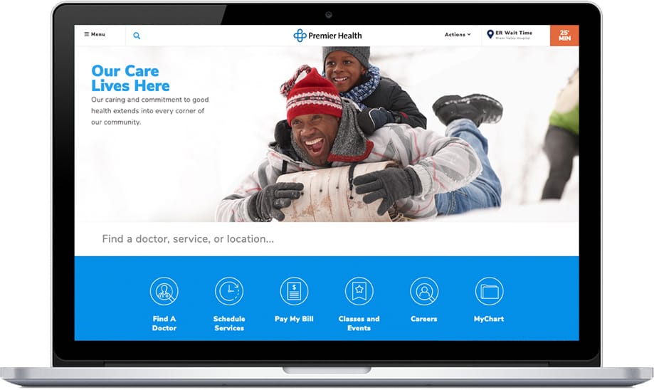
I need help with:
Finding a doctor finding a hospital signing up for MyChart cancer treatment maternity care visiting a patient.
We followed its long-established process to create a consumer journey and experience worthy of the Premier Health name.
At the core, the new experience would take advantage of content personalization so that the consumer journey was tailored to the user making the user feel immediately at home.
Services
Primary and
Secondary Research
Content Strategy
Taxonomy
Development
Design
User Experience
Content
Personalization
Development
SEO
Audience Research
We conducted more than a dozen stakeholder interviews, then our in-house Research Team hosted eight local focus groups with current and prospective patients to determine what mattered most in a healthcare website.
Additional regional surveys provided deeper insights around consumer experience and features and functionality needed for the new design.

Research Services
Industry Landscape
Competitive Landscape
Stakeholder Interviews
Focus Groups
Regional Surveys

Karen Price
Primary Care: Acquisition
Age: 53
Gender: Female
Race: White
Occupation: Small
Business Owner
Education: High School Graduate
Needs/Goals
Identification of a medical provider that is in-network, currently accepting patients, and conveniently located.
User Personas
Audience research uncovered a series of user personas- with the most substantial distinctions by placement in the continuum of care (e.g. provider acquisition vs chronic illness maintenance) and tolerance for research and content consumption (how much effort they were prepared to commit to health and wellness).
Each persona had unique challenges and needs, each requiring different web content, features, functions, and on-site customization.
User Journeys
Considering the entire patient journey, we were able to aggregate the personas into three archetypes based on their health and content behaviors. Common across all personas and journeys was a strong desire for a digital experience that was both simple and easy.
Convenience Seekers
Critical Fixer
Fit Searcher
The CMS Soultion
Because of Premier’s need for personalized experiences, we chose the Progress Sitefinity Content Management platform, as well as their Digital Experience Cloud, to deliver a consistent customer experience across multiple channels and devices. With one of the most robust off-the-shelf functionality set, it also provided an endless amount of possibilities for customized journeys.
UX that Matters
Journey maps and content tracks are key to creating a satisfying online user experience. Primary questions asked and considered were: Are you here to find a doctor? Are you here for more information on a diagnosis? Are you here preparing for a visit to one of our locations?The answers to these questions then segment and lead the user through the appropriate path with content created for specific journeys.
The Digital Experience Cloud
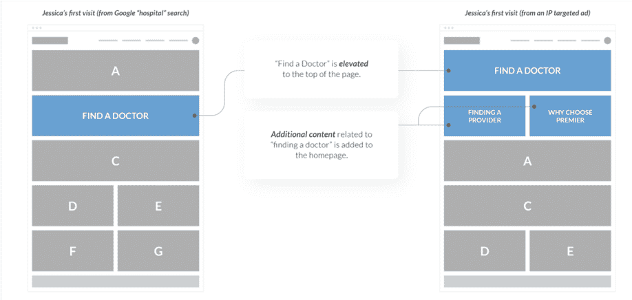
Content Personalization Matrix
Key to a successful personalization plan is the very executional but often overlooked content personalization matrix. It is the map by which all content will be created, curated and otherwise displayed based on the users, behavior, location, segment and campaign.
Enhanced Site Search
The vision for the new PremierHealth.com was this: incredibly helpful, shockingly simple.
It centered around a vision for site search that would not only populate as the user was typing but would be far more intuitive than most site searches of today. Content was categorized to display in sections and move dynamically to indicate what was receiving the most clicks.
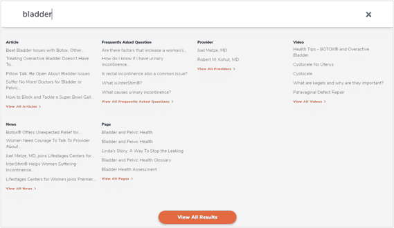
Content Tagging
Each piece of new and existing copy had to be tagged to populate the correct category. This same categorization drives personalization throughout the website.
MyChart Integration
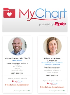
One of the most common pain points across all personas was the cumbersome nature of scheduling an appointment with a physician. Previous site iterations required a user to call the provider’s office during business hours or fill out an electronic request form.
We provided an incredibly helpful, shockingly simple solution – integrating with MyChart to incorporate online appointment scheduling.
Find a Doctor Overhaul
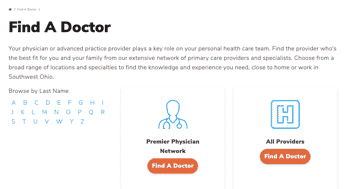
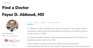
A similar approach of simplification was applied to an overhaul of the Find A Doctor tools – addressing the most common pain points provided by users. The new tool includes a comprehensive set of filters, uniform provider profiles, and a streamlined design.
Results
Organic Traffic
Connect With Us